
One project, three connected surfaces: a customer app, a waiter app and a SaaS dashboard. Grounded in 42 qualitative interviews, built on a two-tier design token system and a WCAG-compliant component library.
UX/UI Design Lead
Figma & FigJam
iOS Mobile App
SaaS Dashboard

Role
UX/UI Design Lead
Tools
Figma, FigJam
Platform
iOS Mobile App
Duration
1 year · 8 milestones
Sub-brands
Byup Fresh (Diner) · Byup Manager (Waiter)
Byup is a restaurant discovery and in-table experience app built around one belief: ‘Taste Your Freedom.’ The platform connects diners with local restaurants through Byup Fresh, while giving waitstaff and restaurant owners a dedicated operations tool through Byup Manager.
The project was structured across two research and design milestones: starting from zero with immersive qualitative user research, then moving into user personas, information architecture, user flows, and full high-fidelity screens for both app sides.
100+
screens across 2 apps & 1 SaaS Dashboard system
3
user types interviewed
200+
sticky notes synthesised
3
native systems




The Problem we are solving
For Diners
“Discovering and ordering at a restaurant is fragmented, confusing, and entirely analog.”
—
Menus are hard to access and often outdated
—
Splitting the bill causes friction at the end of every meal
—
No way to call the waiter or track your order digitally
—
Takeaway ordering lacks a smooth, unified digital flow
For Waitstaff
“Managing multiple tables, orders, and payments without a unified tool is stressful ”
—
No centralized view of active tables and pending order status
—
Order modifications require constant back-and-forth with the kitchen
—
Payment splitting is manual, slow, and often incorrect
—
Task handoff between staff is unreliable and disorganized
Research
We interviewed diners, waitstaff, and restaurant owners across 3 user types. Here’s what the data revealed.
78%
of diners rely on word of mouth
Existing apps keep showing the same mainstream spots, so users stopped trusting them for authentic recommendations.
3 in 4
waiters track tables mentally
No unified tool means everything lives in their head. Errors peak during busy hours when 5+ tables are active simultaneously.
82%
said bill splitting causes tension
It’s the last thing that happens before a memory forms. A bad split experience overshadows an otherwise great dinner.
Analysis
Using interview data, we built empathy maps for each user type, organising what they Think, Feel, Say, and Do into a single view per persona.

Empathy Map · Waiter (Cameriere)

Empathy Map · Diner (Cliente)

Empathy Map · Owner (Gestore)
Emphaty maps ensights
Once the empathy maps were complete, clear patterns emerged: themes that shaped every design decision that followed.
5 core themes
identified across all three user types
2 conflicting needs
between diners and waitstaff that required deliberate trade-offs
1 critical insight
the bill moment is emotional, not transactional
The Diner
Diners want to feel free and at ease at the restaurant. They happily use digital tools, but only when they are simple, clear and unobtrusive. Complicated or opaque apps send them straight back to traditional habits.
Floor Staff
Floor staff face frantic shifts full of small errors, waiting and fragmented communication. They don’t reject technology, but they are used to coping with paper, voice and notes, because digital systems rarely speak their language. What they need is not ‘more digital’, but tools that genuinely lighten the work, even in moments of chaos, fatigue and urgency.
The Owner
Owners deal with fragmented, complex operations: reservations, orders, payments and shifts live across separate tools. They welcome technology only when it truly simplifies the work, looking for integrated, reliable solutions that improve both efficiency and the guest experience.
Information Architecrue
Byup Fresh · Diner App
Home (Vetrina)
Restaurant discovery, search, filters, featured sections, map view
Restaurant Detail
Info, menu categories, photos, ratings, call waiter button
Table Flow
QR scan entry, confirm table, active order view, split payment
Takeaway
Browse restaurant, order, checkout, track delivery status
Profile
Saved payment methods, allergy preferences, order history
Byup Manager · Waiter App
Service (Servizio)
Active table overview, table status, incoming requests real-time
Orders (Gestione)
Create, modify, and track orders per table
Customise (Personalizza)
Dish customisation, modifications, special dietary requests
Payment (Pagamento)
Payment processing, bill splitting, per-seat confirmation
Notifications (Notifiche)
Real-time order alerts and table notifications
Brand fundation
01
Nice to meet you
02
Confort
03
Indipendence
04
Inclusivity
“Split the bill with one tap. That way you don’t do it out loud, and you stay friends.”
Mario B. · Interview 26
“There’s no way to call the waiter without waving. You end up feeling like a nuisance.”
Giovanna C. · Interview 40
“Every app keeps showing me the same famous spots. I stopped trusting them.”
Sandra M. · Interview 55
Design system
Color Palette
Byup Primary · Hot Pink-Red
#E32459
Wine · Dark Background
#4D122E
Near Black · Text & Dark Sections
#141414
Soft Pink · Tags & Tints
#ED9B9B
Lime Green · Energy Accent
#CEFF00
Blush · Light Surface
#FAE3DE
Typography
Display
Headline 1
Taste Your Freedom
Headline 2
Scegli il tuo locale
Body
Benvenuto su Byup. Scopri i ristoranti vicino a te.
Caption
0.8 km · Aperto fino alle 23:00
Spacing Tokens
space-1
4px
space-2
8px
space-4
16px
space-8
32px
space-12
48px
space-16
64px
Component Library
Conferma ordine
Primary CTA
Aggiungi al tavolo
Secondary CTA
Trattoria da Marco
Italiana · 0.4 km · ★ 4.7
Restaurant Card
Pizza
Aperto
Nuovo
Tags & Badges
Tavolo 4 · nuovo ordine
Notification Row
Tavolo 7
In corso
3 persone · 2 portate
Waiter Order Card

UI Design
After finalising the IA and flows, I moved into high-fidelity design in Figma, building both Byup Fresh (diner) and Byup Manager (waiter) with a shared design system, the Byup brand colors, and real Italian UI copy.
The very first touchpoint is a simple splash screen with the Byup wordmark, followed by a quick login. No onboarding tour, no friction: just a fast, welcoming entry into the app.
Splash screen with sign-in
The vetrina (showcase) is the diner’s home screen, driven by a QR scan tab. Depending on the time of day, it automatically switches between a “day” and “night” view, surfacing the venues that make sense for that moment: cafés and lunch spots by day, bars and dinner spots by night.
Vetrina adapts to time of day
The map view lets diners explore venue types by zone, surfacing a quick preview of each locale as they browse. Tapping through opens the full locale detail, with direct access to its menu.
Browse by zone, open the menu instantly
Scanning the table QR drops diners straight into the live table: menu, current order and running total in one place. Three taps take you from scan to a confirmed order, with no account friction at the table.
3 taps from scan to order
Research showed the bill is the most emotionally charged moment of the meal. The split flow reduces it to two decisions, evenly or by dish, and each guest confirms their share from their own phone.
Two decisions, zero arguments
On the other side of the ecosystem, waitstaff see every active table, incoming requests and order status in real time, replacing the mental checklist that 3 in 4 waiters told us they rely on today.
Every table, one glance
Features
Every feature comes from real research with diners, waiters and owners. Nothing for its own sake: only what makes service smoother.
Order from the table with a QR
Scan the code at the table and you’re in: menu, order and bill, with nothing extra to download.
A showcase that changes with the day
Coffee and lunch by day, aperitivo and dinner by night. The right venues at the right moment.
Discover venues by zone
Browse the map by zone, with a preview of each venue before opening its full detail.
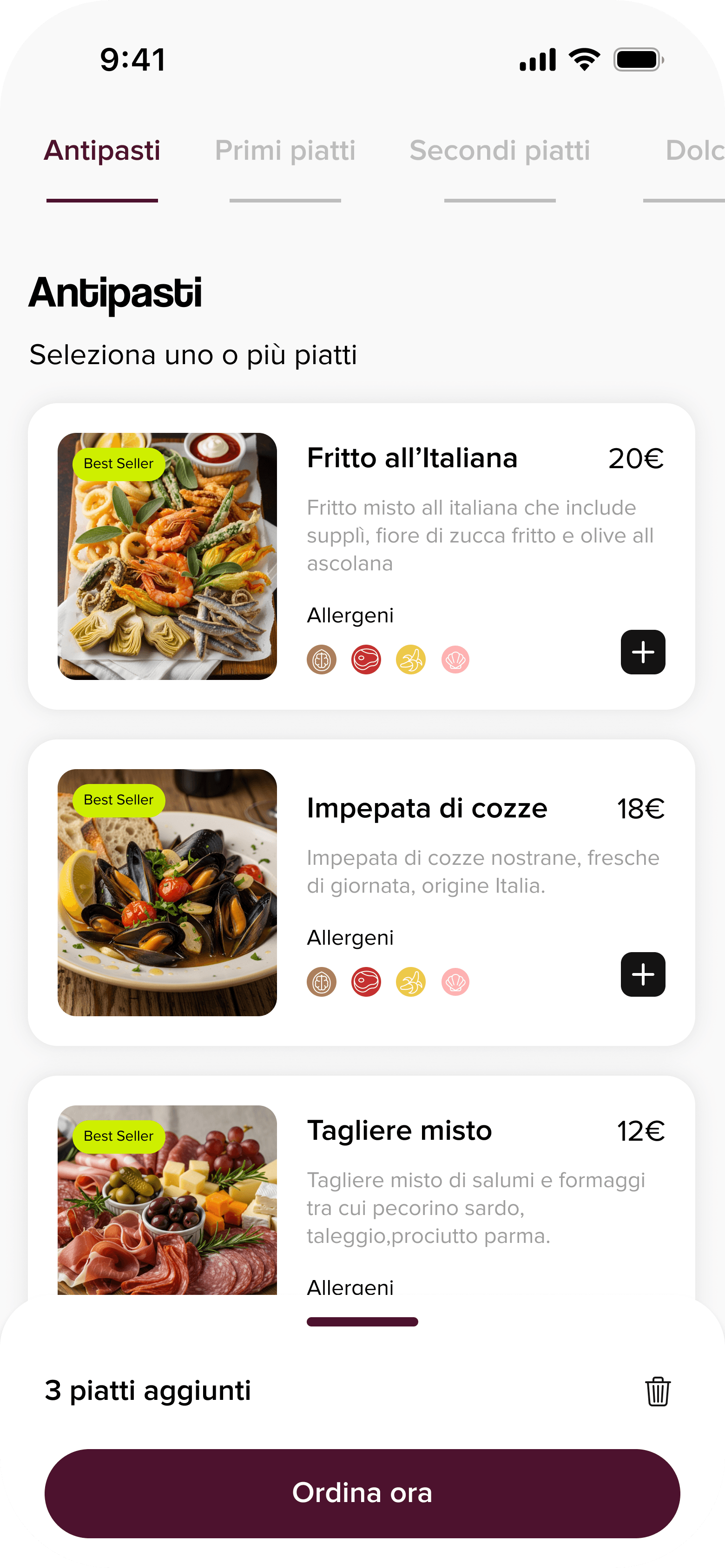
The menu always within reach
Categories, photos and prices updated in real time, straight from the restaurant.
The bill split in two decisions
Split evenly or by dish: no calculator, no end-of-dinner arguments.
Real-time notifications for the floor
New orders, table requests and dish status: the waiter always knows where to go.

01
Interviewing three different user types (diners, waiters, and owners) uncovered tensions we never would have found by designing from assumptions. The richest insights came from comparing what users said against what they actually did.
02
Building a solid information architecture before opening a design file saved enormous iteration time. Every screen had a clear purpose and place in the system because we’d mapped it weeks in advance.
03
The diner and the waiter have opposing needs at key moments, especially around ordering speed and payment clarity. Making both feel seamless required constantly asking: whose experience are we optimising for right now?
04
I’d run usability testing on the payment split flow with real groups at a table: it’s the highest-friction moment in the whole experience and we only validated it with individual interviews. I’d also explore how the Byup Manager dashboard could surface aggregate data to help restaurant owners make smarter menu and staffing decisions.
Byup is an ecosystem: the app for diners and the floor, and the SaaS dashboard for those who run the venue. Explore the other side of the project.

App · Diners & Waitstaff
Byup App
The at-table experience: QR ordering, an always-current menu, split bills and real-time notifications for the floor.
You’re looking at it

SaaS · Owners & Managers
Byup Dashboard
The SaaS system for running the venue: menu, orders, data and daily operations in one place.
View the case study