Overview
Client:
E-Gruppa Sport
My Role:
UX / UI Designer
Duration
14 days design sprint, December 2023
Context
For the Egruppa project, we kicked off with a meeting with stakeholders, where they highlighted a key challenge: users were abandoning the platform during the booking process. The suspected cause was a confusing interface and unclear navigation. Our goal was to simplify the flow and make the platform more intuitive.
One key insight was the need to address two distinct user groups: event organizers, who were familiar with the platform, and participants (athletes), who struggled with the booking and team setup. We aimed to tailor the design to meet both groups’ needs for a smoother experience.

We conducted a competitive analysis on key competitors (click here for details) and carried out user interviews with team trainers to better understand how they manage team travels. The goal was to identify best practices, benchmark against leading platforms, and uncover potential opportunities for Egruppa to stand out.
Here are a few (translated) quotes we gathered from our research:
“Places like Booking or Airbnb normally don’t have availability for that many people.”
"It’s hard to reunite the documents and payments of a big group of people"
“There’s not a lot of offer variety, and we don’t have much time to book something.”
After compiling and analyzing the qualitative data from our market research and competitive analysis, we uncovered key insights that shaped our approach:
Users often struggle to find suitable booking options due to limited variety, making the process more time-consuming than expected.
The platform's value proposition wasn’t clearly communicated, leading to confusion about its purpose and benefits.
Many users resort to booking trips individually, suggesting a need for better tools to streamline group bookings and coordination.
To deepen our understanding of user behavior and pain points, we developed an Empathy Map and a User Persona based on our research findings.
So the challenge became clear: Egruppa’s main issue wasn’t just the booking flow or the platform’s design, but a lack of clear information and urgency driving users to complete their reservations.
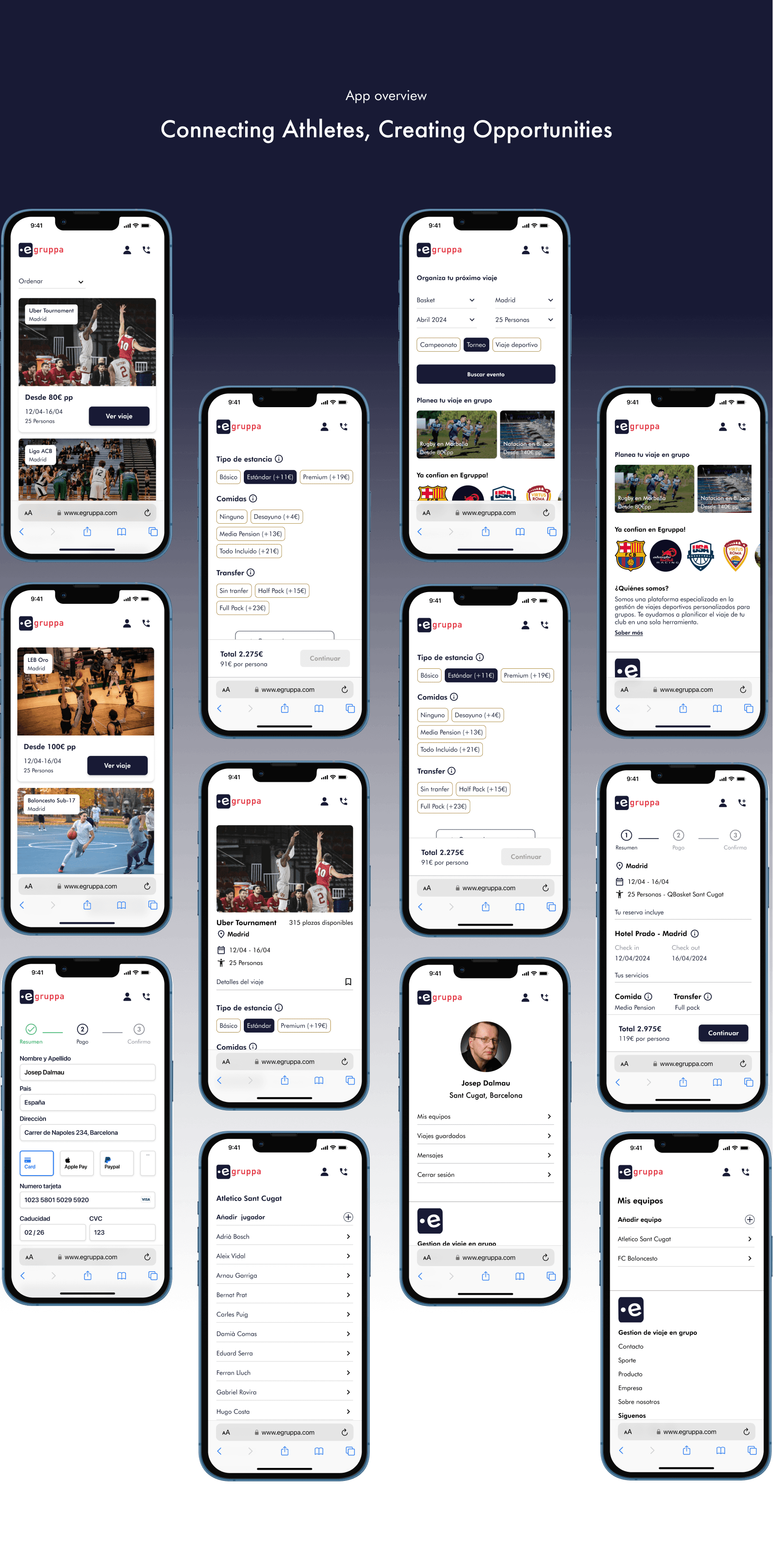
We designed and mapped out the core user flow and user journey for Egruppa, creating mid-fidelity wireframes to improve navigation and usability. Through user feedback, we refined key elements such as information clarity, call-to-action placement, and the distinction between user roles, ensuring a smoother and more intuitive experience.

Style Guide


Search and landing page
All users do an actual search within the product
Simplify the interface and reducing the amount of 'request information' CTA.
Users engage with the search and landing page as key entry points into the platform.
Book an event
Trips can be seen in cards and the user is now able order them as they wish.
We offer the user a clear call to action to complete they’re task.
Customise trip
Eliminate the need of a link/form to users to get a budget.
Give information about the different services provided.
Allow users to share the budget with other people.
Select the team previously created for that specific trip
Secure checkout
Simplify the checkout process by avoiding external links/forms
Provide clear details about included services.
Enable users to share the checkout summary with others.
Allow selection of pre-created teams for seamless payment.
User profile
Organise and oversee team details efficiently
Easily add new players to the team with just a minimal steps.
Choose specific players for upcoming trips